
One shared website. Room for every investment.
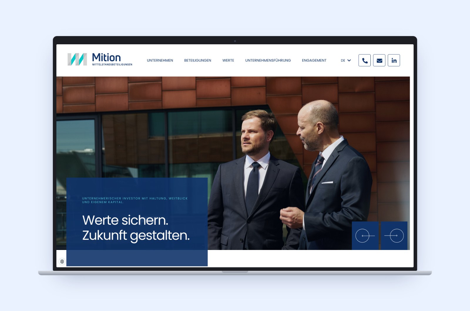
For Mition, we designed a website that presents the investment company and the people and companies behind it. Dark blue, turquoise accents and large image areas define the design. A clear page structure combines information about the company with profiles of its portfolio companies. We developed the design and built the website with TYPO3 in German and English. The new website has been live since November 2025.
Presenting the company and its businesses clearly.
The website was to explain what Mition stands for, how the company works and which businesses it has invested in. Visitors should be able to get an overview and also learn about individual companies in more detail.
This called for not only a shared page structure but also a design that gives the company a recognisable presence while leaving enough room for the individual businesses. The information was to be clearly presented and available in German and English.
From design to a bilingual website.
We worked out the page structure and design, implemented them in TYPO3 and got the website ready for launch.
Design
We developed the web design with large image areas, clearly structured text sections and recurring design elements. From this, we created the layouts for the home page, investment overview, company profiles and other content pages.
Technical basis
We set up the TYPO3 installation and a separate test system for implementing and testing the website.
Responsive implementation
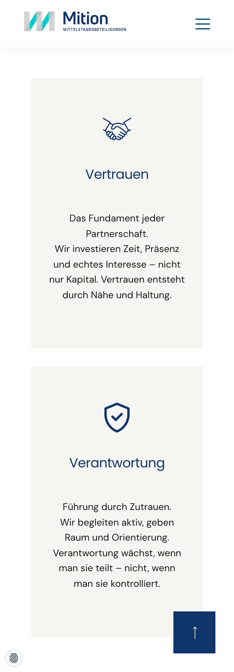
The design was implemented for smartphone, tablet and desktop. Content and navigation were adapted to the different screen sizes.
Content and functions
We set up custom content elements as well as a news list, the contact form and video embedding.
Testing and publication
After functional and browser testing, the website went live in November 2025.
Company and investments at a glance.
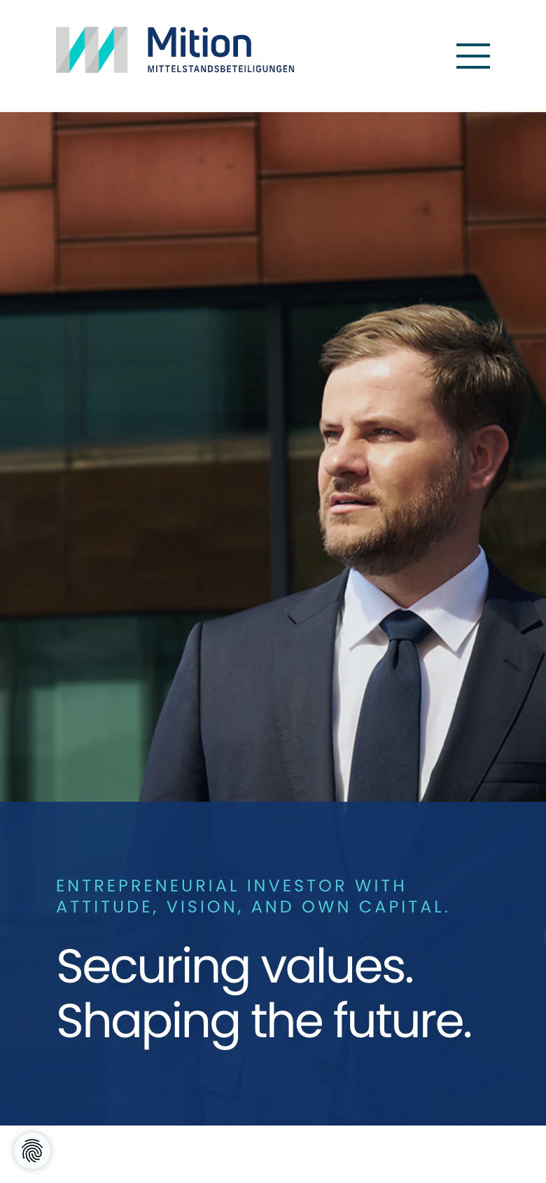
A clear presence. Room for people and businesses.
Dark blue areas give the website a striking frame, while turquoise adds targeted accents. In between, light areas and generous spacing give images and text a calm setting. This design runs from the home page through to the company profiles.
Large photos of the people in charge give the company a personal face. Information on ways of working, values and investments is presented in clearly structured sections. This leaves room for the individual topics without squeezing them into a crowded company overview.
We combined image areas, headings and text sections into recurring layouts. The shared design holds the website together; the content and images of the individual companies create variety within this framework. The German and English versions follow the same design principle.
Investments with conviction
Mition GmbH SME Investments
Each company with its own detail page.
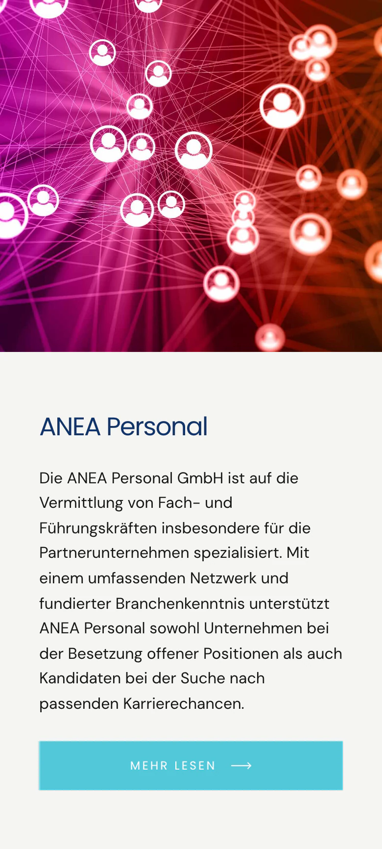
The overview briefly introduces each investment and distinguishes between current and former investments. From there, each one links to its own detail page.
All profiles follow the same structure: key facts such as year founded, location and number of employees, an overview of the company, the shared outlook with Mition and a quote. This way, visitors find the same information in the same place on every page.
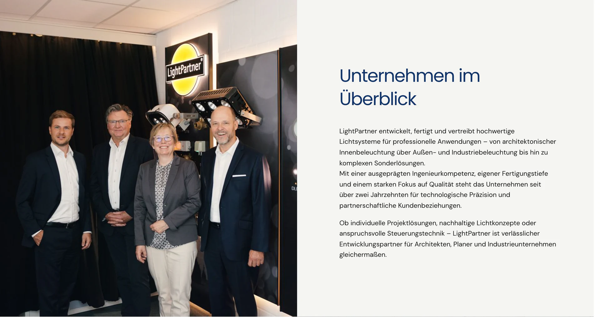
German and English in one shared installation.
The website presents the company and its investments in German and English. The editorial team maintains both language versions within the same TYPO3 installation.
The pages about the company and all company profiles have an English version with its own URL. The language switcher leads directly to the corresponding page in the other language.
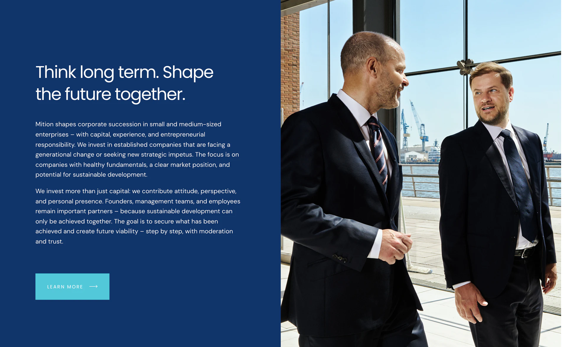
The project in numbers.
How we help with similar projects.
Several companies. One recognisable presence.
We design websites that convey a shared identity while giving individual companies room. To do this, we combine web design, clear page structures and practical editorial maintenance. Talk to us about your company website.


